How Typography Quietly Controls User Attention
Apr 2, 2026
When people visit a website, they rarely notice the typography first. They notice how the page feels. Whether it’s easy to read, visually pleasing, or slightly confusing, that reaction is often driven by typography. Fonts quietly guide the reader’s eyes, influence behavior, and shape how content is understood, without users even realizing it.
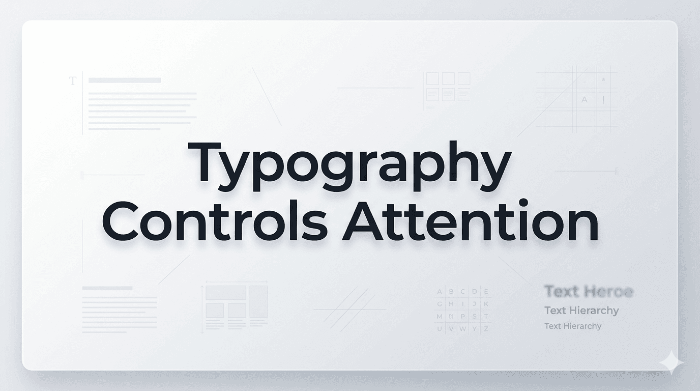
Typography is not just about choosing a good-looking font. It’s about controlling attention, building hierarchy, and making content effortless to consume.
The Psychology Behind Typography
Every font sends a subtle message. Clean, modern fonts feel trustworthy and professional, while decorative fonts can feel creative or playful. When used correctly, typography builds an emotional connection between your content and the reader.
For example, sans-serif fonts like Montserrat and Poppins are widely used because they offer clarity and simplicity. If you want a modern and clean design, many designers prefer to download Montserrat Fonts for headings and pair them with body text that is easy to scan.
Typography works at a subconscious level. Users don’t think about why they trust a website; they just feel it. And fonts play a huge role in that feeling.
Visual Hierarchy: Guiding the Reader’s Eye
One of the most powerful ways typography controls attention is through hierarchy. Headlines, subheadings, and body text create a clear path for the reader to follow.
When hierarchy is done right:
Users know where to look first
Important information stands out
Content becomes easier to scan
Bold headings naturally grab attention. That’s why many designers choose to download Poppins Bold Font for strong, impactful titles. It creates contrast and immediately tells the reader, “This is important.”
Without proper hierarchy, even great content can feel overwhelming. Readers may leave simply because they don’t know where to focus.
Readability vs. Aesthetics
A common mistake is choosing fonts based only on style. While aesthetics matter, readability is what keeps users engaged.
Good typography ensures:
Comfortable reading on all devices
Proper spacing between letters and lines
Clear distinction between sections
Fonts like Bebas Neue are visually striking and perfect for headings. Many creatives download Bebas Neue Fonts to create bold, attention-grabbing titles. However, using such fonts for long paragraphs would hurt readability.
The key is balance, use expressive fonts for emphasis and simple fonts for body content.
White Space and Breathing Room
Typography isn’t just about the font itself. Spacing plays a critical role in controlling attention.
White space (or negative space) allows content to breathe. It helps:
Reduce visual clutter
Improve focus
Make content feel premium and clean
When text is cramped, users feel overwhelmed. When it’s spaced properly, reading becomes effortless. This subtle difference can dramatically impact how long someone stays on your page.
Typography and User Behavior
Typography doesn’t just influence how content looks; it affects how users behave.
Well-structured typography can:
Increase reading time
Improve content understanding
Boost conversions
Clear headings encourage users to keep scrolling. Well-designed call-to-action text grabs attention at the right moment. Even button fonts can influence whether someone clicks or not.
Typography acts like a silent guide, leading users exactly where you want them to go.
Consistency Builds Trust
Consistency in typography creates a sense of stability and professionalism. When fonts, sizes, and styles remain uniform across a website, users feel more comfortable navigating.
Inconsistent typography, on the other hand, can:
Confuse users
Break visual flow
Reduce trust
A strong typographic system ensures that every page feels connected. This consistency is especially important for brands that want to appear reliable and polished.
The Role of Typography in Modern Web Design
In today’s digital world, users scan more than they read. This makes typography more important than ever.
Modern design focuses on:
Clean layouts
Minimal distractions
Strong visual hierarchy
Typography sits at the center of all these elements. It determines how quickly users understand your content and whether they choose to stay or leave.
Conclusion
Typography quietly controls everything, from where users look to how they feel about your content. It shapes readability, builds trust, and guides attention without making noise.
Choosing the right fonts, maintaining hierarchy, and ensuring consistency can completely transform the user experience. If you want to explore high-quality font options for your projects, platforms like Free Font Download offer a wide range of styles that help designers create clean, engaging, and effective designs.
In the end, great typography isn’t loud or flashy; it works silently in the background, making your content impossible to ignore.